A pattern I've seen often: a beautiful 3D configurator launches on a product page. The team is proud. Engagement goes up — visitors spend more time on the page. Conversion stays flat. Sometimes it goes down. Six months later, leadership asks why the expensive 3D feature didn't move the metrics it was supposed to move.
The configurator works perfectly. It's also solving the wrong problem.
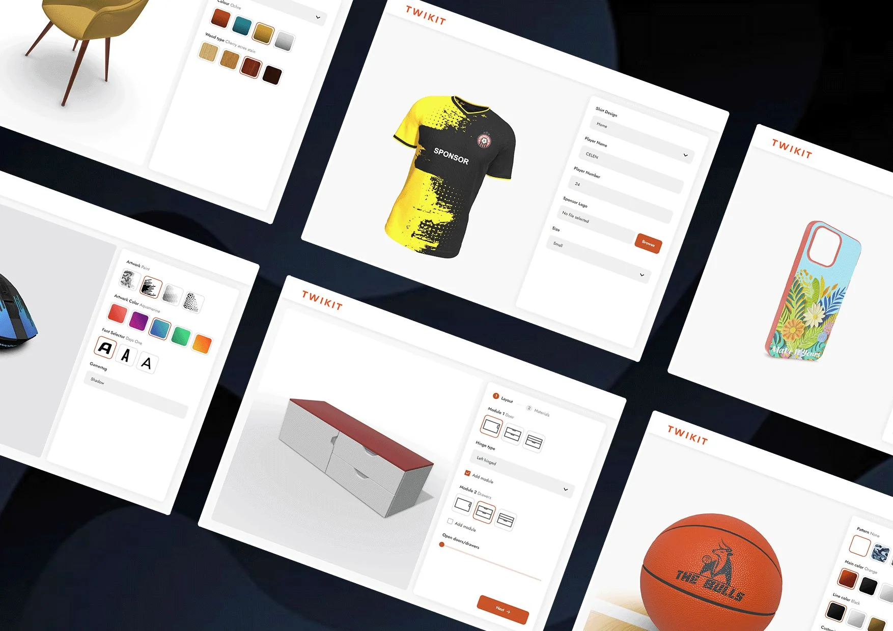
This article is about that gap. A configurator that looks cool and a configurator that converts are different products built around different priorities. Most product teams scope the first and assume the second will follow automatically. It usually doesn't. If you're hiring an independent 3D configurator developer right now to build for an e-commerce or product page, the difference between these two outcomes is the difference between revenue impact and an expensive design ornament.
The two configurators
A configurator that looks cool optimizes for visual impact in the first ten seconds. A configurator that converts optimizes for the buyer's confidence at the moment of purchase decision. These are not the same thing.
The first kind is what you see in agency portfolios — beautiful materials, smooth camera moves, cinematic lighting, moody backgrounds. The product is rendered with care, the interactions feel premium, the experience is memorable. People share screenshots. The marketing team is delighted.
The second kind is what works on Shopify product pages that actually sell things. It looks more utilitarian. Bright, even lighting so the buyer can see colors accurately. Hard cuts between options, not animated transitions. Big, obvious controls. Mobile-first because that's where the traffic is. Price updates in real-time as options change. The configuration ends in a buy button that's never more than one tap away.
Both have a place. The mistake most product teams make is scoping the first when they wanted the second.
Why beautiful configurators often hurt conversion
Counterintuitive but real: a configurator that's too beautiful can reduce conversion. The mechanisms:
Cognitive load. A cinematic configurator with smooth camera moves and elaborate transitions makes the buyer think they're in an experience, not a purchase flow. They stop being a buyer and start being a viewer. Buying requires a different mental mode than browsing. Configurators that put users into experience-mode delay or cancel the purchase decision.
Loading time. The configurators that look the most impressive usually weigh the most. A configurator that takes eight seconds to load on mobile is a configurator that loses 70% of the audience that would otherwise have engaged. Visual fidelity above the page weight budget actively destroys conversion.
Decision friction. Beautiful camera moves between configuration changes feel premium but slow the buyer down. A buyer who wants to compare two color options should be able to flip between them in a quarter second. A configurator that animates the camera over a one-second arc between options makes that comparison feel ten times longer than it is. Friction at the comparison step is friction at the decision step.
Mobile performance. The most cinematic configurators almost always require desktop-class GPU performance. On mobile, they fall apart. Mobile-first products that have mobile-second configurators lose conversion on the device most of their buyers are using.
The most expensive configurator visually is often the worst-performing configurator commercially.
The patterns that move metrics
Here are the UX patterns I see in configurators that actually convert. Each one is straightforward; together they're substantially different from the cinematic-default approach.
1. Price always visible, always updated
The price should be visible at all times and update instantly when configuration changes. Not "in a moment." Not "after you click confirm." Now.
This is the single highest-leverage UX decision in a configurator. Buyers calibrate their willingness to commit by watching the price as they configure. A configurator that hides the price reduces buyer confidence at exactly the moment confidence matters.
For a configurator with complex pricing logic — components, options, accessories — pre-compute as much as possible client-side and update the price in the same animation frame as the visual change. A 200-millisecond delay on price updates feels broken.
2. Direct comparison, not sequential viewing
Buyers compare options. The configurator UI should make comparison fast.
The patterns that work: small color swatches that the buyer can hover or tap-and-hold to preview without committing. Side-by-side preview when viewport space allows. Hard cuts between options instead of animated transitions, so flipping back and forth is instant.
The patterns that don't: requiring full configuration commits before seeing each variant. Animated transitions that take more than 200ms. Modal dialogs for option selection.
3. Options that the buyer would actually consider
A configurator with 64 colors and 40 trim options looks impressive. It also paralyzes most buyers. Decision fatigue is real and configurators amplify it.
The senior call: curate aggressively. Show the 6 colors that 95% of buyers actually choose. Tuck the rest behind a "show all options" expansion. Default the configurator to a popular configuration so the buyer can convert without making any choices if they don't want to.
This conflicts with what merchandising teams often want — they want to surface every SKU. Negotiating that conflict is part of the engagement.
4. Progressive disclosure of complexity
A configurator for a product with eight option types should not present all eight at once. The buyer's first impression should be the product, beautifully rendered. Configuration controls reveal as the buyer engages.
The pattern: show the product centered with maybe one or two primary options visible immediately (e.g., color). When the buyer interacts, additional option groups appear. The most important options first; secondary options after.
This makes the page feel approachable on first view rather than overwhelming, while still exposing the full configuration depth to engaged buyers.
5. A single, prominent buy button
The buy button should be visible at all times during configuration. Not at the bottom of a long page. Not behind a "next" button. Right there, with the current price, throughout the flow.
For mobile, this often means a sticky bottom bar with the price and CTA. The buyer can configure, see the price update, and commit at any moment without scrolling.
6. Camera control that respects the buyer's intent
A buyer who wants to look at the back of the product should be able to. A buyer who doesn't shouldn't be forced into camera moves they didn't ask for.
Auto-rotate is usually wrong. It demos beautifully on the page-load video the marketing team records. It actively interferes with buyers trying to make decisions. Default to a still product, beautifully framed, with explicit interaction available.
The mobile-first reality
For most e-commerce in 2026, a configurator that doesn't work brilliantly on mobile is a configurator that doesn't work. Desktop-first configurator development is malpractice on a product page that takes mobile traffic seriously.
The mobile-first design priorities for a converting configurator:
- Touch-first UI from the start, not a desktop UI shrunk for mobile
- Color swatches large enough for thumbs (44×44 px minimum)
- The product render large enough to actually see, even when configuration controls are visible
- A bottom-sticky buy bar with current price
- No hover-dependent interactions
- Page weight under the mobile budget — usually 5 MB total for the configurator and assets combined
The configurators I'd hold up as examples — the ones that move the metrics the brand cared about — almost all share these mobile-first patterns. The ones that don't, almost universally don't.
When the cinematic configurator is the right call
To be fair: there are projects where the cinematic, look-cool configurator is genuinely the right answer.
- Brand-flagship marketing pages where the goal is brand impression and the buyer's purchase decision happens elsewhere (a dealer, a showroom, a longer sales cycle).
- Limited-edition or hero products where the product is the message and the configurator is part of the announcement.
- Premium-brand contexts where utilitarian UX would feel off-brand and the visual experience is itself a product attribute.
For these, the metric that matters isn't conversion on the configurator page — it's brand impression, lead generation, or downstream pipeline. The configurator should be scoped to that metric, not retrofitted to a conversion goal it was never designed for.
The mistake to avoid: scoping a cinematic configurator and then measuring it on conversion metrics. Or scoping a conversion-optimized configurator and feeling disappointed that it doesn't look like the agency portfolio piece. Pick the goal first. Scope the configurator to match.
What this means for the engagement
The first conversation with a 3D configurator developer should be about which configurator you actually want — and what success looks like. Skip that conversation and you'll get a configurator that's beautiful and underperforms, or functional and underwhelming.
When I scope a configurator development engagement, the question I ask earliest is what business metric the configurator is meant to move. AOV uplift on a product page. Conversion rate on a SKU-heavy catalog. Lead capture for a high-consideration product. Customer service ticket reduction for a complex SKU set. Each of these implies a different configurator. Knowing which one before the build starts is what separates a project that ships and works from a project that ships and doesn't.
For an in-house team that's never built a configurator before, the design choices above are exactly the patterns that look obvious in hindsight and aren't obvious when you're scoping a first project. Hiring someone who's shipped these once before is faster than discovering the patterns through your own A/B tests.
If you have a configurator project that needs scoping — whether it's a first build or a redesign of one that's underperforming — the discovery call is where we figure out which of the patterns above are missing and which are the highest-leverage to add. Most underperforming configurators have two or three specific issues. Identifying them up front saves the whole engagement.